
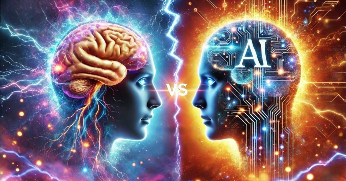
AI & Design
2026
Somewhere in 2025, the internet started looking the same. Every SaaS startup had the same gradient hero section. Every agency had the same sans-serif bold headline over a clean white background. Every portfolio had the same smooth, frictionless scroll. AI-assisted design had arrived — and it made everything look polished, professional, and completely forgettable. Then something interesting happened. Brands started fighting back with wobbly lines, handwritten fonts, and deliberately imperfect layouts. And those sites? They started converting better.
“When everything is perfect, nothing is interesting. The wobble is the point.”
What Happened When AI Took Over Web Design
AI design tools genuinely changed the industry. What used to take a designer three days now takes three hours. Templates got smarter, colour combinations got more harmonious, and layouts became technically flawless. For smaller businesses, this was liberating. For the internet as a whole? It created a visual monoculture.
Open ten randomly chosen websites today and notice how similar they feel. Rounded cards. Muted neutral backgrounds. Bold heading, short subheading, button below. Scroll-triggered animations. Footer with a newsletter signup. There is nothing wrong with any of it. And that’s exactly the problem — there’s nothing memorable about it either.
When every site looks like it passed through the same AI filter, visitors stop registering them as distinct. Your brand stops being a brand and starts being a category. You become “another web agency” or “another software product” — not the specific, human-driven business you actually are.
The uncanny valley of design: Just like a near-perfect humanoid robot can feel eerie and off-putting, near-perfect AI-generated design can feel sterile and hollow. Visitors can’t always explain why a site feels cold — they just know it does. And they leave.
Why Imperfection Is Now a Design Strategy
The shift started in branding first. Independent businesses, small studios, and creative agencies began deliberately roughing up their visuals. Hand-drawn icons instead of icon libraries. Scanned paper textures instead of clean gradients. Handwriting-style fonts instead of geometric sans-serifs. Doodle annotations in the margins of product screenshots.
These weren’t lazy design choices — they were intentional ones. And they worked, because they did something AI-polished design structurally cannot do: they communicated that a human being was behind this. Someone made a decision, held a pen, drew something, chose something specific. That specificity builds trust in a way that optimised perfection simply cannot.
Think about the difference between a handwritten note and a printed card. The printed card might look better by every measurable standard. But the handwritten note means more. That principle scales to websites when applied with intention.
“Imperfection, done deliberately, is the most powerful signal of authenticity a brand can send online right now.”
AI-Polished Design vs. Human-Led Design: What Actually Differs
| Design Element | ✗ AI-Polished | ✓ Human-Led |
|---|---|---|
| Illustrations | Vector icon libraries, clean and uniform | Hand-drawn, sketchy, or custom — visibly unique |
| Typography | Geometric sans-serifs, mathematically spaced | Mix of typefaces including script, handwriting styles |
| Layout | Symmetrical grids, even spacing throughout | Intentional asymmetry, organic white space |
| Texture | Flat colours or smooth gradients | Paper grain, pencil marks, rough edges |
| Animations | Smooth, physics-based, scroll-triggered | Playful, bouncy, hand-crafted feel |
| Brand feel | Professional, competent, forgettable | Distinctive, warm, memorable |
The Brands Getting This Right
This isn’t a fringe trend happening in niche creative circles. Major brands and successful startups are leaning into human-made aesthetics at scale. Food and beverage brands are using hand-lettered packaging and websites that look like they came from a local farmers market stall — even when they’re shipping globally. Fintech startups that want to feel approachable are replacing slick dashboards with illustrations that look like someone doodled them in a notebook.
The pattern is consistent: brands in competitive, trust-sensitive industries — finance, health, education, professional services — are finding that a more human visual language reduces friction and increases conversions. Visitors feel like they’re dealing with real people, not a faceless digital product.
And for smaller businesses, this is actually great news. You don’t need a million-dollar rebrand to implement this. A custom hand-drawn illustration on your homepage, a slightly imperfect hero section, a personal founder’s note in a handwriting font — these small signals compound into a distinctive identity that no AI tool will accidentally replicate for your competitor.
When “Human Design” Goes Wrong
There’s an important difference between deliberately imperfect and just poorly made. This trend doesn’t give you permission to skip good design thinking — it actually requires more of it.
Imperfect ≠ unprofessional
A hand-drawn element that looks like it was rushed and scanned badly signals carelessness, not character. The wobbly line needs to be a confident wobbly line. Intentionality is everything — the viewer can sense whether a creative decision was made or a mistake was ignored.
Don’t sacrifice usability for aesthetics
An unreadable handwriting font in body text, or a layout so organic that users can’t find the navigation — these are not charming quirks, they’re conversion killers. Human design should feel warm, not confusing. Structure still matters.
Copying the trend without owning it
If you add a hand-drawn squiggle to your site because you saw it on someone else’s and it looked nice, it will feel exactly like what it is — borrowed. The human design trend works because it expresses something true about the brand. If there’s nothing genuine behind the aesthetic, visitors feel that too.
How to Add Human Design to Your Website Without Starting Over
Commission one custom illustration for your homepage hero
It doesn’t have to be elaborate. Even a small hand-drawn scene or character that represents your brand’s personality can instantly set you apart from every competitor using the same stock illustration packs.
Replace generic icons with hand-drawn alternatives
Services sections with hand-drawn icons instead of library icons feel warmer and more considered. Tools like Blush or working with a local illustrator can get you there without a huge budget.
Use a handwriting accent font for pull quotes or section labels
You don’t need to change your whole typography system. Adding a single handwriting-style typeface for callouts, annotations, or personal notes creates contrast that feels human without breaking your brand consistency.
Add subtle texture to backgrounds
A very light paper grain or noise texture over a white background adds just enough imperfection to make a page feel tactile and real — without making it look unfinished. It’s one CSS line that changes everything.
Write your “About” section like a human being
This is often the most overlooked piece of human design — the words. If your About page reads like a LinkedIn summary processed through a press release, no amount of hand-drawn illustration will save it. Write how you actually talk. That’s human design applied to copy.
“AI can generate a perfect website. Only a human can build a website that feels like yours.”
The irony of 2026 web design is that the most technologically advanced studios are using their skills to make things look less technologically produced. Not because they’ve rejected AI — many use it heavily in their workflow — but because they understand what their audience responds to. And right now, audiences respond to human.
The brands winning online this year aren’t the ones with the most polished sites. They’re the ones with the most recognisable ones. There’s a difference. And that difference is almost always a human decision somewhere in the design process that no algorithm would have made.
Want a website that actually looks like you?
We design sites with personality — not just pixels. If you’re ready to stand out instead of blend in, let’s have a conversation about what makes your brand genuinely different.